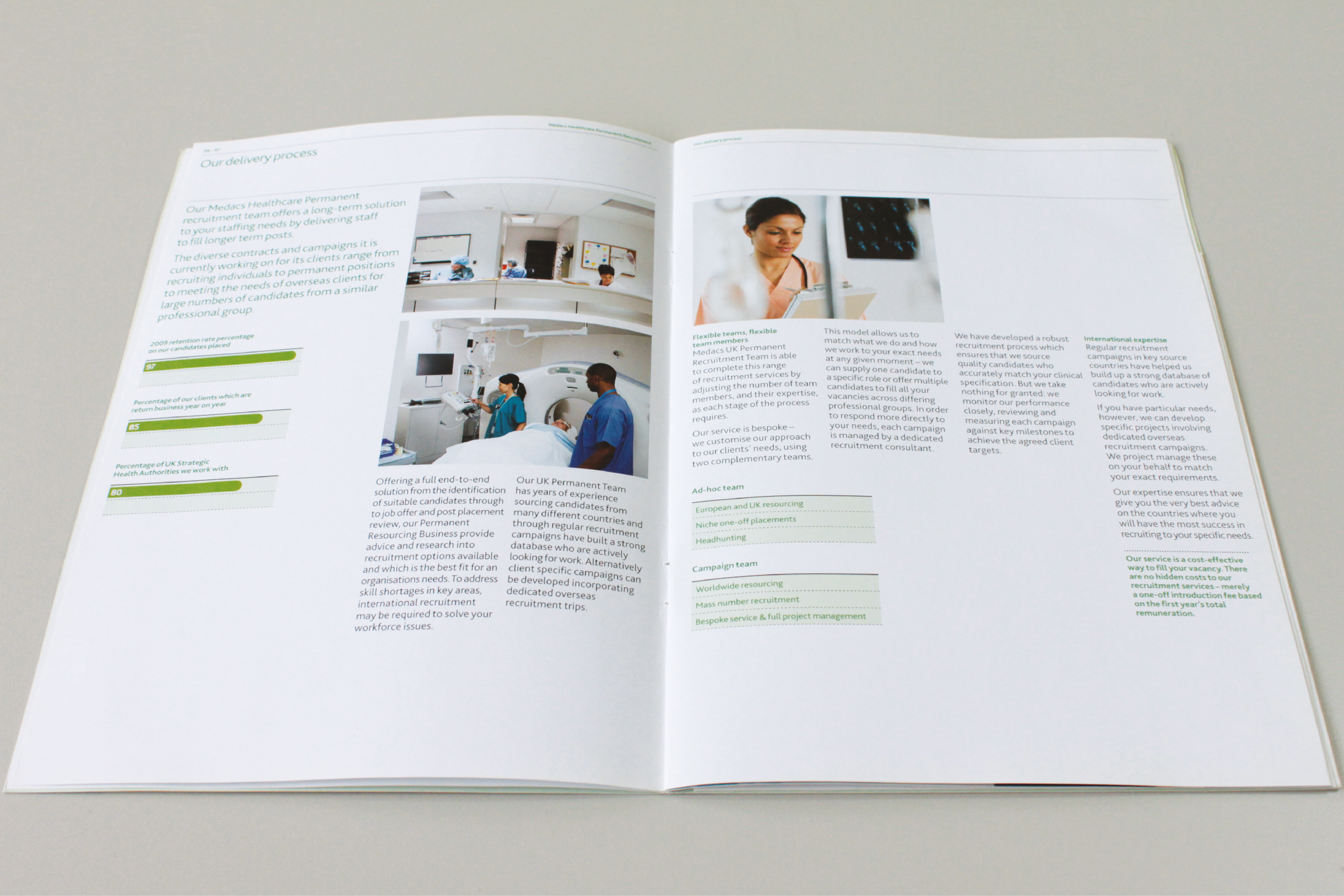
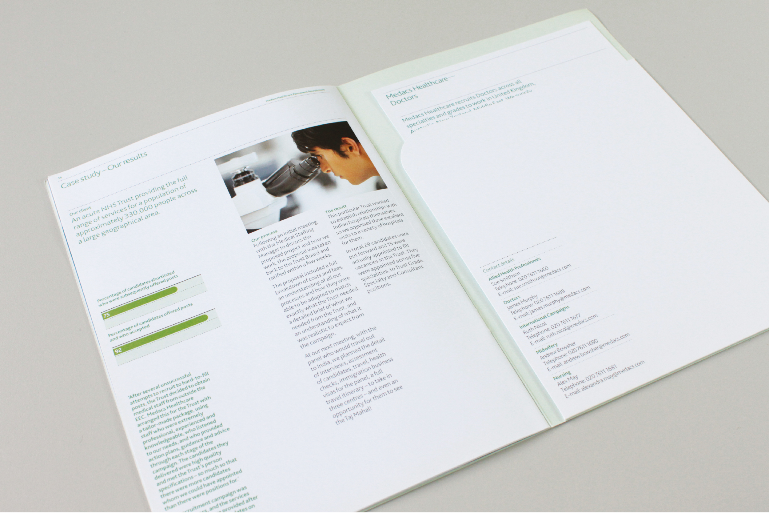
Following a successful pitch we were commissioned by Medacs Healthcare to develop and execute a brand refresh, producing a number of pieces of internal and external collateral. It was felt necessary to strengthen the brand's overall visual language, develop consistency within the brand and convey the professional, efficient, friendly approach complimenting the company's work ethic
The identity features the use of lozenge elements inspired by the use at the base of the existing Medacs logotype. These elements are utilised to add texture and dynamise the communication of Medacs Healthcare's printed and digital collateral adding to the brand value.
These components strengthen the brands identity and are designed to convey movement, of which is the core physical trait of Medacs Healthcare's service to the healthcare recruitment industry, moving candidates from a to b. The lozenge elements also carry connotations of DNA result marks, underlining Medacs working in the healthcare sector.


